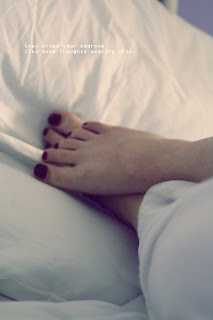
This image reminds me of early Sunday mornings, but originally for me the image was too bright, so I upped the gamma brightness on it and created more of a white effect on top of the image. The main focal point in this picture is the model’s toenails because they’re the darkest part to the image making them the automatic focal point. I like how the sheets and the pyjama bottoms are both white because they become obsolete within the image making the feet the main focal point. I put simple text in the left corner of the image because I felt the image was so simple the text needed to be as simple to not over power the image. I really like how the sheets in the background are creased because I think it adds to the effect of a Sunday morning making the image picturesque.

This image is very eye catching because of the colours of the green grass are very vibrant. The main focal point to this image is the sunlight in the centre top of the image, because it s the brightest point, the eye is drawn to it. The eye is then drawn throughout the rest of the image registering all the pieces of grass and the boldness of the green, although the colours are a little over powering I think that this is what makes the image. I like how some of the grass pieces are not in focus so it creates the effect of a background from the focused pieces of grass. I like how the eye is drawn to the water droplet which is hidden behind a piece of grass, I like the idea that you cannot focus on it straight away, but after looking closely at the image you can spot it. I edited the image in this way to create a strong contrast between each piece of grass and the background. I liked the idea of having an over powering green because I wanted the image to be more complex than just pieces of grass. I choose this font because like the image I wanted you to look closely at the font to see what it actually said. Although some may disagree in that I should of used a simpler font, I like the complex italics and the idea of reading more into an image.


