Sunday, 28 March 2010
clouds study♥
I took a series of images of clouds because i really liked how my last sky/cloud picture turned out, and i thought it would be an interesting topic to take a few pictures of. These are my favorite images from this particular shoot, i really like the way the sun highlights the tops of the clouds, i think it really defines the images, creating lots of different levels to look at within the picture. I edited the images to be more deifined because i wanted the clouds to be the biggest focal point within the image. I wanted the text to be seen, but not the most important part to the image because i think the pictures speak for themselves. I really like the colours within all the pictures because they are all subtle blues and whites but the darker blues and black define the images, making them fit together as a collection.
the landscape♥analysis
This is one of my favourite images from this set of pictures; I really like the composition of the image because there is a different focal point than just the landscape – the bird house. I think that the bird house being a prominent item within the image breaks it up creating a very interesting foreground, and with a light background the foreground becomes more of a silhouette. I think that the sky creates for an interesting contrast and I like how the sky fades from a darker blue to a lighter blue. My favourite part to the image is the clock inside the bird house, I like how because it is white it becomes a prominent focal point in the image. I put the text in to foreground because I felt it needed to be in a eye catching place, because the silhouette is such a strong background.
Although this is a simple image, I really like it. I like how I’ve managed to capture the sun’s raise throughout the image and how the clouds are a very prominent part to the picture. The focal point to the image is from the sun at the bottom and up to the clouds and then the viewer focuses on the darker blue background. I placed the text so central in the image because the image is so simple, it needed to be a prominent part to the image. I chose to use a different, fancier font because I felt it wouldn’t divert from the image, and would add to the picture.
The main focal point to this image is probably the sunrise in the background to the picture because the eye is drawn to the brightest colour. The eye is then drawn to the clouds and then through to the bottom on the image, with the outlines of the trees and the darker clouds. I personally think the composition of this image is aesthetically pleasing because the colours are very mellow, and there for not harsh on the eyes. I decided to place the text in a prominent place on the image, but yet hidden by the clouds because I thought that you should have to look harder at an image to really see all the detail, so by looking closer to read the text, the viewer also notices the tree outlines and the darker clouds, and the general beauty within the image.
Thursday, 18 March 2010
party portraiture♥analysis
This is one of my favourite images because I really like the composition, the outlines of the subjects are really strong against the back lighting making a aesthetically pleasing image. I like the colours created by my editing on photoscape, i like the soft tones to the background against the strong blacker figures. I also like how you can see some parts of the figures highlighted by the back lighting. Also i like how you cannot see the faces of any of the subjects, which creates mystery to the image.
I like this image because it isnt classically cropped. I like the fact that the heart is the main subject of the image rather than the figure. I really like the way the heart is the main focal point in the image but then then eye is lead around the image noticing the text and the rest of the image. The colours in this picture are quite dull, but yet the heart is the brightest focal point. I also like how the figure is off centre to the image, lengthening the image. I like how if you look past the foreground towards the backgroung you can see the rest of the party, and can make out figures, creating an intresting background. And although its not a picturesque image, i really like it.
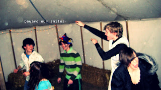
This picture wasnt suppost to be cropped quite so dramatically, but i really like the way it came out. I think that the picture sums up the word for happiness, because he is smiling such a big smile, i feel that the viewer can't help but smile too. I choose to put this image into black and white because i felt the colour was too over powering and i feel like the black and white makes the image simple again - like a smile. I placed the text so large in the centre of the image to be the next focal point after the large smile. Because the words on the image are important for the meaning. After you're noticed the text the eye is drawn to the girl to the right of the text, and you notice that its a smiley portrait.
I edited this image on photoshop using the colour curves and filters. I really like this image because there is nothing else in the image but the main focal point is the subject. I like how you cannot really see the subjects face or expression. I like the crop of this image, because you cannot see around the subject and her hair also fades into the background. I like the colours in this picture because the green of the cardigan and the slight red of the hair are the main focal point of the image, creating something to look at. I put the text more onto the background because theres not much to the acctally image, and I didnt want to subtract from the actual image. I like the paleness to the skin, and how perfect it looks compared to the black of the background.
Subscribe to:
Comments (Atom)


