Wednesday, 21 April 2010

Landscape♥


Portraiture♥


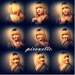
These images are the last of contrasting words with two images put together. These pictures are of my cousin and I feel that i caught him at just the right moments for cute portraits. I think that they go well together because each image is within seconds of each other. I decided to edited them in a cold, slightly darker way to create an eerier effect to the image because i thought it would create a strong contrast against the venerability of the original images, and the pose of the picture in general. I like how in the top image, the picture shows how he'd been caught in the act and i like the naturalness of the image. The focal point is defiantly the child's eyes in the images because the eye is drawn to the centre of the image and the centre of the face leading to the eyes, the viewer is then lead to the text also in the centre of the picture as a whole. I choose to use contrasting words to the image to show a clear contrast between what the image 'really does mean' and what I've made it mean. Because obviously the child is not corrupt but it makes the viewer question what they're looking at, and looking for deeper meaning or evidence of this corruption i've labelled on the child. 

Saturday, 3 April 2010

Portraiture♥


I liked the idea of using picture to portray emotion but then the text completely contrasting the emotion of the image. I tried to link several images together to create a complete contrast of emotion that not one picture was the same to almost confuse the viewer. I used the word disapointment because all but about 2 images are the complete opposite of disapointment, I liked the idea that the viewer had to look to between all the emotions to look for the disapointment within this image. The picture doesnt really have a focal point as being 16 portraits there are 16 focal points but I think that every image has its own uniqueness for the viewer to focus on. I choose to convert the images to black and white because i felt they had to be more simple because there was so many to look at - also black and white is more appealing to the eye!


These are my favourite images out of several that were taken because I feel they work well as a six and also in their seperate two's. I choose to put similar emotions together but at opposite scales of that emotion because I felt that when I put the contrasting word across the image it would make more of an impact. I think the most sucessful of these three images is the middle image because its very a solemn picture, so by having 'euphoria' placed on top in such an obvious way creates a real contrast. And although the image is obviously not euphoric, I think it creates a great contrast making the viewer look at the image in a different light than if I had place the word 'sadness' on top of the image. I chose to edited each set in a slightly different way creating a slightly brighter effect if the image was happier and a greyer, duller image if it was sader. I think colour works for these images because theres not much to them, so the colour creates the focal point and the interest within the image.

Sunday, 28 March 2010

clouds study♥

I took a series of images of clouds because i really liked how my last sky/cloud picture turned out, and i thought it would be an interesting topic to take a few pictures of. These are my favorite images from this particular shoot, i really like the way the sun highlights the tops of the clouds, i think it really defines the images, creating lots of different levels to look at within the picture. I edited the images to be more deifined because i wanted the clouds to be the biggest focal point within the image. I wanted the text to be seen, but not the most important part to the image because i think the pictures speak for themselves. I really like the colours within all the pictures because they are all subtle blues and whites but the darker blues and black define the images, making them fit together as a collection.

the landscape♥analysis

This is one of my favourite images from this set of pictures; I really like the composition of the image because there is a different focal point than just the landscape – the bird house. I think that the bird house being a prominent item within the image breaks it up creating a very interesting foreground, and with a light background the foreground becomes more of a silhouette. I think that the sky creates for an interesting contrast and I like how the sky fades from a darker blue to a lighter blue. My favourite part to the image is the clock inside the bird house, I like how because it is white it becomes a prominent focal point in the image. I put the text in to foreground because I felt it needed to be in a eye catching place, because the silhouette is such a strong background.

Although this is a simple image, I really like it. I like how I’ve managed to capture the sun’s raise throughout the image and how the clouds are a very prominent part to the picture. The focal point to the image is from the sun at the bottom and up to the clouds and then the viewer focuses on the darker blue background. I placed the text so central in the image because the image is so simple, it needed to be a prominent part to the image. I chose to use a different, fancier font because I felt it wouldn’t divert from the image, and would add to the picture.

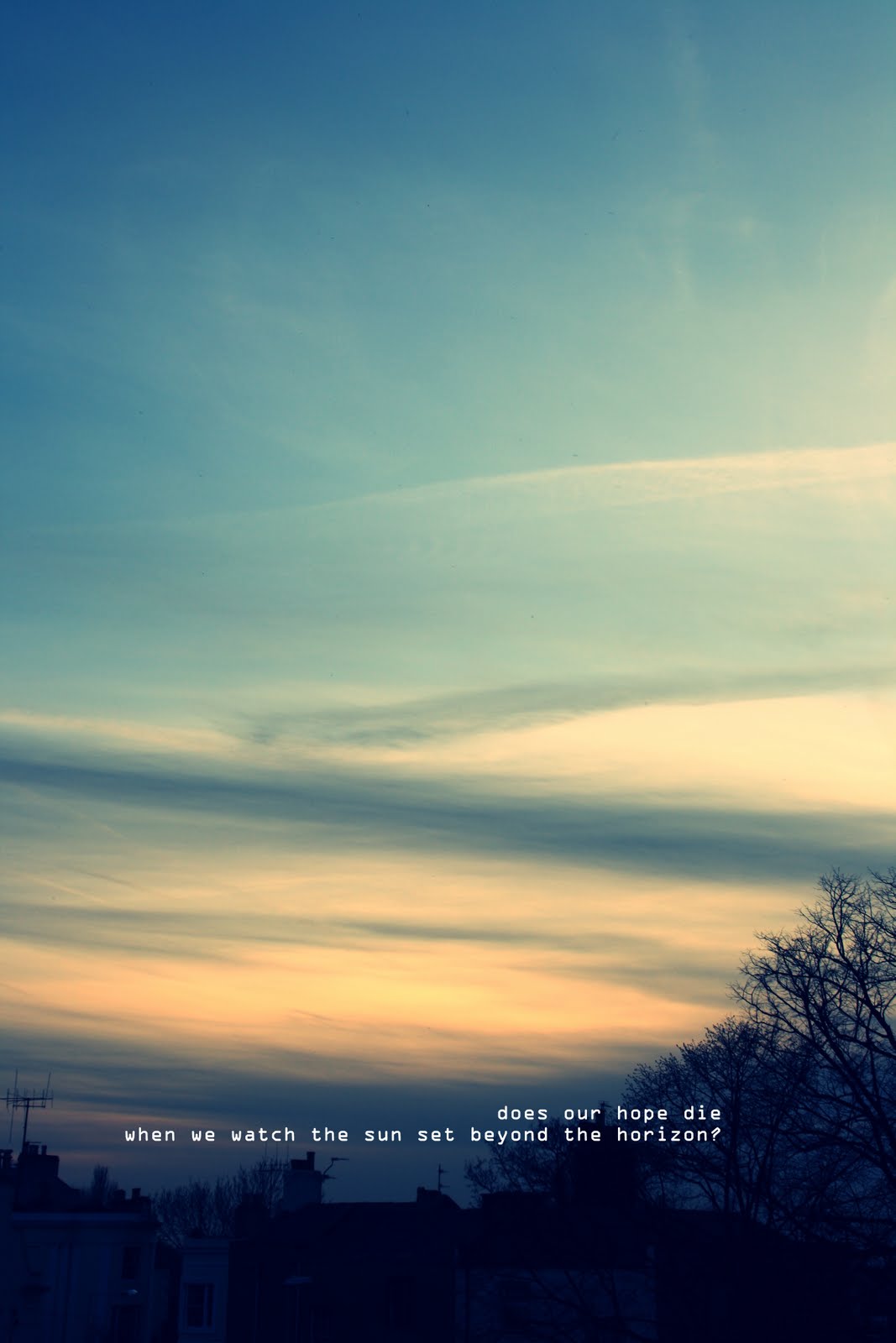
The main focal point to this image is probably the sunrise in the background to the picture because the eye is drawn to the brightest colour. The eye is then drawn to the clouds and then through to the bottom on the image, with the outlines of the trees and the darker clouds. I personally think the composition of this image is aesthetically pleasing because the colours are very mellow, and there for not harsh on the eyes. I decided to place the text in a prominent place on the image, but yet hidden by the clouds because I thought that you should have to look harder at an image to really see all the detail, so by looking closer to read the text, the viewer also notices the tree outlines and the darker clouds, and the general beauty within the image.